
Master team workload visualization for better planning



TL;DR:
- Resource bottlenecks often develop unnoticed, leading to missed deadlines, burnout, and client dissatisfaction. Effective workload visualization requires a clear team capacity, centralized work data, and suitable visual tools to identify imbalances early. Regular reviews and adaptive rebalancing cultivate sustainable team productivity, especially in dynamic startup environments.
Resource bottlenecks rarely announce themselves. They sneak up quietly, one overloaded engineer at a time, until deadlines slip, people burn out, and clients start asking uncomfortable questions. Bottlenecks and uneven workload distribution cause missed deadlines and team stress at growing organizations, yet most SMBs and startups still rely on spreadsheets or gut feelings to manage who is doing what. Team workload visualization is the practice of mapping every task, ticket, and commitment onto a shared visual layer so imbalances are obvious before they become emergencies. This guide walks through the full process, from gathering prerequisites to measuring real results, so your team can plan with confidence instead of hope.
Table of Contents
- What you need before visualizing your team’s workload
- Step-by-step team workload visualization process
- Common pitfalls and troubleshooting
- What success looks like: measuring results and iterating
- The reality: why simple beats perfect in startup team management
- Try a smarter way to visualize and balance your team workload
- Frequently asked questions
Key Takeaways
| Point | Details |
|---|---|
| Visual clarity | Seeing workloads makes it much easier to spot overloads and rebalance quickly. |
| Right tools matter | Simple, flexible tools like boards and charts make setup and ongoing management much easier. |
| Weekly reviews prevent issues | Consistent, scheduled reviews ensure estimates and allocations stay realistic as projects evolve. |
| Iterate and scale | Audits and templates help teams move from manual juggling to effective, scalable resource planning. |
What you need before visualizing your team’s workload
Before you open any tool and start dragging tasks around a board, you need three foundational elements in place. Skip any one of them and your visualization will look clean but mean nothing in practice.
1. A clear definition of team capacity
Capacity is not just headcount. It is the actual available time each person has for focused work after meetings, administrative tasks, and unplanned requests are subtracted. You can express capacity in hours per week, tasks per sprint, or story points, depending on how your team estimates work. The key is picking one unit and sticking with it across the board. Mixing hours for some people and points for others creates comparison problems that undermine the whole exercise.
2. Centralized work data
If tasks live in three different tools, half the team tracks work in email threads, and meetings never get counted as capacity consumers, your visualization will always be incomplete. Before you build any view, pull everything into one place. That means tasks, support tickets, recurring operational work, and yes, the two hours of weekly standups that nobody ever accounts for in planning. Good team capacity planning starts with an honest inventory of what people are actually working on, not just what is officially assigned.
3. The right visual tool features
Not all project management tools are built equally for workload visualization. You want tools that offer color-coded overload indicators, drag-and-drop rebalancing, and views by person, team, or timeline. Capacity mechanics include setting capacity by hours, tasks, or points, plus drag-and-drop rebalancing and views by person, team, or timeline to prevent daily spikes and cross-project overloads. Integration with time tracking matters too, because estimates without actuals drift quickly.
Here is a quick checklist before you start:
- Every team member has a defined weekly capacity in your chosen unit
- All active projects and tasks are entered in one system
- Recurring work (standups, reviews, admin) is accounted for
- Roles are clearly assigned so work maps to the right person
- Basic estimates exist for at least 80% of open tasks
| Prerequisite | Why it matters | Quick fix if missing |
|---|---|---|
| Defined capacity | Prevents meaningless percentages | Set a team default (e.g., 32 focused hours/week) |
| Centralized tasks | Avoids invisible workload | Import from other tools via integrations |
| Time tracking integration | Connects estimates to reality | Use a lightweight tracker for one sprint first |
| Role clarity | Assigns work accurately | Run a 30-minute role mapping session |
Pro Tip: Set capacity at 80% of total available hours by default. That 20% buffer absorbs the unplanned work that always appears and keeps your visualization honest rather than aspirational.
Building scalable project workflows also requires you to document these inputs once so future projects start from a reliable baseline rather than from scratch every time.
Step-by-step team workload visualization process
Once prerequisites are ready, follow this systematic process to visualize and manage your team’s workload efficiently.
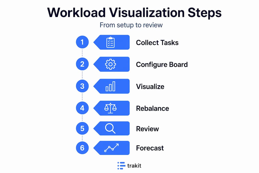
Step 1: Collect and categorize all work items
Pull every open task, project milestone, ticket, and recurring obligation into your tool. Group them by project, then assign an owner and an estimate to each item. Do not skip the recurring work. A senior developer who runs two daily standups, a weekly architecture review, and a one-on-one with their manager has already consumed roughly six to eight hours before touching a single code ticket.
Step 2: Configure your workload board
Set up views by person and by timeline. Most tools give you a choice of visual formats. Color-coded workload views show utilization at a glance, with green for healthy, yellow for approaching limits, and red for overloaded. Pick the view your team will actually read in a weekly review, not the most impressive looking one.
Step 3: Run your first visualization pass
Look at the workload spread across your team for the next two to four weeks. Immediately note anyone showing above 90% utilization. Note anyone below 60%. Both are problems. Overloaded individuals are burnout risks. Significantly underloaded individuals often signal unclear assignment or missed planning.
Step 4: Rebalance and assign gaps
Use drag-and-drop to shift tasks from overloaded individuals to those with available capacity. Where no one is available, flag the task as a scheduling risk and escalate to the project owner. This step is where smarter workload visualization pays off most visibly: what previously required a meeting to discover now takes two minutes of scanning.
Step 5: Review weekly and update actuals
A workload visualization is only as current as its data. Schedule a fixed 15-minute weekly review where each team lead checks utilization, updates completed work, and flags any new items that emerged mid-week. Research on consistent review practices confirms that consistent dates and estimates, combined with weekly reviews and centralized work data, correlate with higher project success rates.

Step 6: Integrate forecasting
Once your visualization is running for a few weeks, use it to forecast delivery. If a team member is at 85% for the next three weeks, you know they cannot absorb a new project without something moving. Forecasting from real utilization data is dramatically more accurate than timeline estimates made in isolation.
Here is a comparison of the three most common visual formats:
| Visual format | Best for | Weakness |
|---|---|---|
| Bar chart (used in tools like ClickUp) | Comparing individuals side by side | Can feel abstract for non-planners |
| Visual bubbles (used in tools like monday) | Seeing team-wide density quickly | Less precise for hour-level detail |
| Trend lines (used in tools like Asana) | Tracking utilization over time | Requires clean historical data to be useful |
Pro Tip: Aim for 80-90% utilization as your target range. Teams running at 100% allocation have no buffer for bugs, scope creep, or sick days. Studies show that avoiding 100% allocation and maintaining heterogeneous task distribution correlates with higher project success rates. Use proven workflow examples from similar teams to calibrate what healthy utilization actually looks like.
Common pitfalls and troubleshooting
Even good processes are only as strong as their weakest link. Here is where teams stumble, and what to do about it.
Red flags to watch for:
- One person consistently in the red while others are in the green
- Nobody ever showing above 70% (suggests tasks are not fully entered)
- Visualization looks great on Monday but is never updated by Thursday
- Estimates are always round numbers (a sign of guessing, not measuring)
- Meeting time is never counted in anyone’s load
The “perfect utilization” trap
Managers sometimes try to get everyone to exactly 80% utilization. That sounds efficient but is actually counterproductive. Real work is lumpy. Some weeks require a sprint, others are naturally lighter. Forcing perfect distribution through constant rebalancing creates administrative overhead that eats the time you were trying to save.
“The goal is visibility, not symmetry. Knowing who is overloaded matters far more than making every bar the same height.”
Research on team dynamics shows that experienced teams communicate less but achieve higher productivity, and that balancing utilization at 80-90% is the sustainable zone for preventing burnout without sacrificing output. Targeting that range as a band, not a precise number, is the right approach.
Troubleshooting common problems:
- Inconsistent data quality: Require all task estimates before sprint kickoff. Make it a team norm, not a manager’s job to chase.
- Bottleneck individuals: If one person always shows red, the problem is rarely laziness. It is usually a role design issue or unclear delegation. Pair their overloaded tasks with a less loaded team member for knowledge transfer.
- Unbalanced sprints: If sprints consistently end with half the work incomplete, your estimates are systematically optimistic. Add a 20% buffer to all estimates for one sprint and compare results.
- Tool adoption failure: If the team stops updating the board, the tool is too complex or the review habit is too weak. Simplify to one view and anchor the weekly review to an existing meeting.
Good scheduling and resource allocation practices also include building in explicit slack time for unplanned work, which is the single most common oversight in startup planning. Pair that with streamlined scheduling tips to keep your process light enough that the team will actually sustain it.
What success looks like: measuring results and iterating
With pitfalls addressed, benchmark your progress and create a continuous improvement loop.
How to quantify improvement
After four to six weeks of consistent visualization, you should see measurable shifts in three areas:
- On-time delivery rate increases as scheduling conflicts surface before they affect deadlines rather than after
- Overload incidents decrease because red utilization flags are caught in weekly reviews before they compound
- Team engagement improves because people feel workload is managed fairly and transparently
Key metrics to track:
| Metric | Baseline (before visualization) | Target (after 90 days) |
|---|---|---|
| On-time delivery rate | Typically 55-65% for unstructured teams | 75-85% with consistent review |
| Average utilization | Often unknown or 95%+ on paper | 80-90% sustainable range |
| Sprint carry-over rate | High (30-40% of tasks not completed) | Low (under 15%) |
| Planning time per sprint | 2-3 hours of meetings | Under 45 minutes with good data |
One statistic stands out for teams wondering whether the investment is worth it: data-driven capacity planning is rare but yields 6.3x better deal wins for revenue-facing teams, which signals a compounding advantage that goes well beyond operational tidiness.
Building an iteration loop
Success in workload visualization is not a destination. It is a rhythm. Run a monthly audit of your templates and estimates to check whether your assumptions still match reality. Gather feedback from team members quarterly about whether the process feels helpful or like overhead. Use that input to trim steps that are not adding value.
Signs your team has outgrown its current process include: the tool struggles to show cross-team dependencies, forecasts are consistently off by more than 20%, or planning discussions take longer than they did before you started. At that point, scaling up means investing in tools with capacity forecasting and multi-team views rather than adding more manual steps to what you already have. Project audits and scaling practices give you a structured way to decide when and how to level up.
Iteration steps that compound:
- Review actuals vs. estimates after every sprint
- Update capacity baselines when roles or team size changes
- Archive completed project templates for reuse on similar work
- Share utilization trends with leadership quarterly to inform hiring decisions
- Celebrate visible improvements publicly so the team sees the value of the process
The reality: why simple beats perfect in startup team management
Here is the view that most planning guides will not give you. The biggest gains from workload visualization do not come from achieving perfect balance. They come from making imbalances visible fast enough to act on them.
Fast-growing startups operate in conditions where priorities shift weekly, headcount changes, and scopes expand without warning. Chasing a perfectly balanced workload in that environment is not just unrealistic; it is actively harmful because it pulls your attention toward optimization theater rather than real work.
What actually moves the needle is training yourself and your team to recognize and respond to “red spots” quickly. A red utilization flag that gets addressed in a Monday review costs almost nothing. The same overload, invisible until Thursday when a deadline is missed, costs client trust, team morale, and re-planning time.
Research on task distribution makes a counterintuitive point: heterogeneous distribution of work, meaning uneven loads that reflect actual project complexity rather than artificial smoothing, correlates with higher success rates in complex projects. The goal is not to make everyone’s bar the same height. It is to make sure nobody’s bar is so tall it falls over.
Embracing a degree of controlled unevenness also allows your best people to surge on the work that matters most, without being pulled away to rebalance for the sake of a tidy chart. The discipline is in the review cadence, not the distribution. If you can see it, you can manage it. If you are chasing symmetry, you are managing the visualization instead of the work.
Smart project planning at a growing company means accepting that the system will always be a little messy, and building habits that surface the important signals before they become expensive problems.
Try a smarter way to visualize and balance your team workload
If this guide has shown you anything, it is that workload visualization is not a one-time setup. It is an ongoing practice that rewards teams who build it into their weekly rhythm.
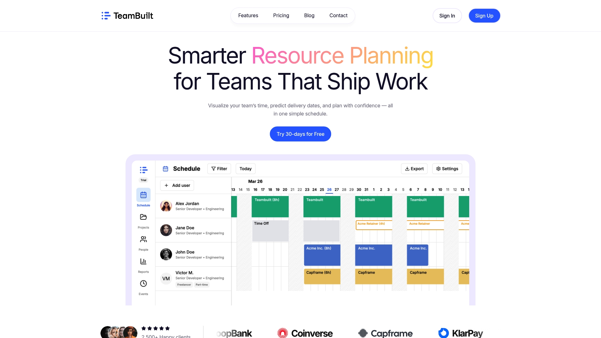
TeamBuilt is built specifically for the kind of dynamic, multi-team environments this guide describes. From real-time utilization views to capacity forecasting and cross-team coordination, the platform brings everything covered in this guide into one collaborative space. Whether you are replacing a patchwork of spreadsheets or scaling beyond what your current tool can handle, the resource planning features give you the visibility and control to plan with confidence. Start with a single team, prove the value in 30 days, and scale from there.
Frequently asked questions
What is a workload visualization process?
It is a systematic method to visually map each team member’s tasks and capacity, making project planning and load balancing more efficient. The core mechanics include setting capacity by hours, tasks, or points, with views by person, team, or timeline to prevent spikes and cross-project overloads.
Which tools are best for visualizing workloads in startups?
Visual boards with flexible views are most popular for startup teams due to their simplicity and adaptability. Visual formats vary widely: bubbles and circles suit quick density scans, bar charts work for side-by-side comparison, and trend lines support longitudinal tracking, each with trade-offs in setup complexity.
How often should teams review their workload visualizations?
Weekly reviews are the standard because they catch scope changes before they compound into missed deadlines. Consistent review cadences combined with centralized work data and reliable estimates are the practices most strongly tied to project success.
How do you avoid burnout during heavy projects?
Target 80-90% utilization as your planning ceiling, not 100%, and use real-time dashboards to flag overload as it builds rather than after the fact. Proactive burnout prevention via automations and dashboards keeps experienced team members productive without pushing them past sustainable limits.
Recommended
- Harness visualization for smarter project planning in 2026 | Teambuilt Blog
- Harness visualization for smarter project planning in 2026 | Teambuilt Blog
- Optimize Team Capacity: A Practical Guide for Growing Teams | Teambuilt Blog
- Optimize Team Capacity: A Practical Guide for Growing Teams | Teambuilt Blog