
Why Track Cross-Department Utilization in 2026


TL;DR:
- Tracking cross-department utilization helps identify resource imbalances and enhances collaboration across teams.
- Using centralized dashboards and shared metrics promotes proactive capacity planning, reduces costs, and improves productivity.
Cross-department utilization tracking is defined as the systematic measurement of how resources, tools, and team capacity are used across different organizational units to identify imbalances and reallocation opportunities. Business leaders who track utilization across departments recover budget from idle licenses, reduce burnout, and unlock the kind of cross-department collaboration benefits that siloed reporting simply cannot reveal. This article explains why track cross-department utilization matters, how to read the data correctly, and what separates leaders who use it well from those who misuse it entirely.
Why track cross-department utilization: the core case
The most direct answer is this: without cross-department visibility, you are making resource decisions based on incomplete data. One team runs at 90% capacity while another sits at 35%. Neither manager knows. The result is missed deadlines on one side and wasted payroll on the other.
Utilization dashboards solve this by displaying heatmaps that color-code department usage from below 40% (flagged red) to above 80% (flagged green). That visual layer turns abstract spreadsheet data into a decision you can act on in the same meeting.
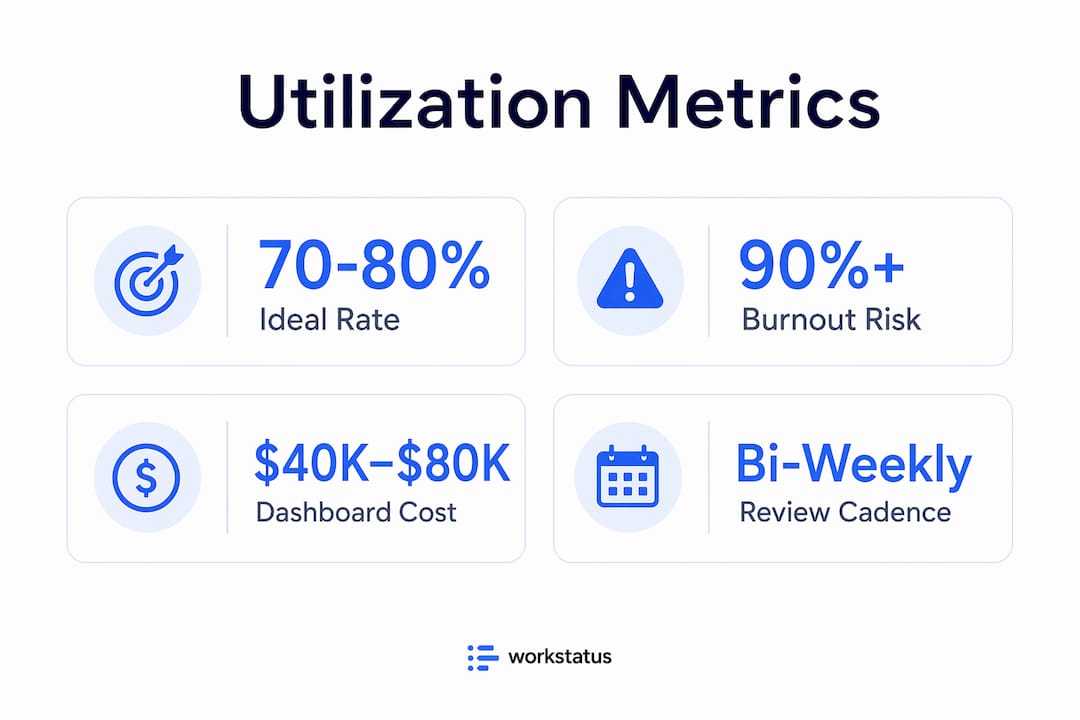
The financial case is equally direct. Custom utilization dashboards cost between $40,000 and $80,000 to build. Organizations that deploy them typically recover that investment within months by canceling unused SaaS licenses, reallocating underused seats, and avoiding duplicate tool purchases across departments.
Pro Tip: Set a reporting cadence of at least bi-weekly for utilization reviews. Monthly reviews miss short-term spikes that cause burnout before anyone notices.
What utilization metrics actually measure
Utilization metrics, the formal industry term for this category of data, measure the percentage of available capacity that a team or tool is actively consuming. A developer team with 10 members, each available 40 hours per week, has 400 hours of total capacity. If they log 360 billable or productive hours, their utilization rate is 90%. That sounds healthy until you realize there is zero buffer for urgent requests or creative problem-solving.
The importance of utilization metrics goes beyond raw percentages. Context matters. A 90% rate in a support team during a product launch is expected. The same rate in a product design team for six consecutive months is a warning sign.
How dashboards reveal hidden imbalances
The most useful workload visualization tools display utilization by department, role, and individual tool in a single view. When an operations leader can see that the marketing team uses a project management platform at 15% of its licensed capacity while engineering uses a separate tool at 110% of its intended load, the reallocation decision becomes obvious.

Here is what a basic cross-department utilization snapshot looks like in practice:
| Department | Available Capacity | Actual Usage | Utilization Rate |
|---|---|---|---|
| Engineering | 400 hrs/week | 360 hrs/week | 90% |
| Marketing | 200 hrs/week | 70 hrs/week | 35% |
| Customer Success | 160 hrs/week | 128 hrs/week | 80% |
| Product Design | 120 hrs/week | 114 hrs/week | 95% |
This table shows the kind of imbalance that goes undetected when each department reports independently. Engineering and Product Design are at risk of burnout. Marketing has significant capacity that could absorb cross-functional work.
What are the business benefits of tracking utilization across departments?
The benefits of cross-department tracking extend well beyond cost control. The most significant finding in recent workforce research is that companies with high cross-functional collaboration are 5 times more likely to be high performing and report up to a 76% productivity improvement through real-time workload visibility. That is not a marginal gain. It is a structural advantage.
Here is what that translates to in practice:
- Reduced duplication. When two departments unknowingly run parallel projects, tracking shared resource usage surfaces the overlap before it wastes weeks of effort.
- Faster capacity planning. Leaders who see utilization trends across teams can forecast hiring needs and project timelines with real data rather than gut estimates.
- Better vendor negotiations. Actual utilization data gives procurement teams hard numbers when renegotiating SaaS contracts. Vendors cannot argue against a dashboard showing 30% seat usage.
- Lower attrition risk. Teams with developer satisfaction scores below 6 out of 10 are 3 times more likely to lose staff within 12 months. Utilization data that flags chronic overload gives managers a chance to intervene before people leave.
“Tracking utilization primarily as a cost-cutting tool ignores its real value in capacity planning and retention, which improves productivity sustainably.” — Cross-Departmental Collaboration Multiplies Results
The retention angle is one most leaders underestimate. When a team is consistently running above 90% utilization with no relief in sight, the first people to leave are the highest performers. They have options. Utilization tracking, when shared transparently with teams, signals that leadership is paying attention to workload, not just output.
Tracking resource allocation also improves how departments collaborate on shared projects. When everyone can see capacity in real time, the conversation shifts from “we don’t have bandwidth” to “here is exactly what we can take on and when.” That specificity removes friction from cross-team planning. For a closer look at how real-time collaboration changes team dynamics, the mechanics are worth understanding in depth.
What are the common pitfalls in using utilization data?
The most damaging mistake leaders make is using utilization data to evaluate individuals rather than systems. Best-practice metric programs are team-owned and designed to surface systemic bottlenecks, not assign blame. When managers use utilization scores in performance reviews, employees respond by gaming the numbers. That is Goodhart’s Law in action: the metric becomes the target, and the underlying behavior it was meant to measure disappears.
The second major pitfall is setting utilization targets too high. Elite teams target 70–80% utilization deliberately, not because they are underperforming, but because that range preserves slack for urgent tasks, innovation, and recovery from unexpected disruptions. Organizations that push targets above 90% create brittle systems where a single sick day or scope change cascades into missed deadlines.
Pro Tip: Set your utilization ceiling at 80%, not 100%. The 20% buffer is not wasted capacity. It is your organization’s ability to respond to anything unexpected without a crisis.
Building a governance layer that actually works
The practical challenge in measuring department efficiency across multiple teams is that each department uses different tools with different data structures. Engineering tracks story points in Jira. Marketing tracks campaign hours in Asana. Finance tracks time in a billing system. None of these speak the same language natively.
A governed context layer maps these diverse workflow metrics to a shared taxonomy, avoiding the manual consolidation failures that kill most tracking initiatives. Most attempts to build cross-department visibility fail because teams try to standardize tools rather than standardize the meaning of data. The governance layer approach standardizes meaning while letting each team keep its preferred tools.
The three components of an effective governance layer are:
- A shared metric dictionary that defines what “utilization,” “capacity,” and “availability” mean across all departments.
- An integration layer that pulls data from each tool into a central dashboard without requiring manual exports.
- A review cadence where department leads see the same cross-functional view, not just their own slice.
Balancing utilization data with satisfaction signals
Utilization numbers alone tell you what is happening. Satisfaction data tells you why. A team running at 75% utilization with low satisfaction scores is a different problem than a team at 75% with high engagement. The first team may be doing the wrong work. The second is doing the right work at a sustainable pace.
Effective resource management strategies pair utilization dashboards with regular pulse surveys or satisfaction scores. The combination gives leaders both the quantitative signal and the qualitative context to make decisions that hold up over time. The benefits of capacity tracking become most visible when these two data streams are reviewed together.
How do you implement cross-department utilization tracking?
Implementation follows a four-step sequence that most organizations can execute within one quarter.
- Audit current visibility. Map every department’s existing tools and identify where capacity data already exists. Most organizations have more data than they realize. It is just scattered across disconnected systems.
- Define your metrics. Choose three to five utilization metrics that apply across all departments. Capacity utilization rate, billable hours ratio, and tool adoption rate are the most universally applicable starting points.
- Select a centralized platform. Choose a dashboard that pulls data from existing tools via API rather than requiring manual input. Platforms with real-time scheduling and workload visualization built in reduce the integration burden significantly.
- Establish shared accountability. Cross-department utilization data only drives change when department leads review it together. A monthly cross-functional review meeting where all leaders see the same dashboard is the single highest-leverage habit you can build.
The comparison below shows the difference between siloed and centralized tracking approaches:
| Approach | Visibility | Decision Speed | Reallocation Ability |
|---|---|---|---|
| Siloed department reports | Department only | Slow, manual | Reactive |
| Centralized utilization dashboard | Full organization | Fast, real-time | Proactive |
| Governed context layer + dashboard | Full organization + context | Fastest | Strategic |
The governed context layer approach consistently outperforms the others because it combines breadth of visibility with the interpretive context leaders need to act confidently.
Key takeaways
Cross-department utilization tracking delivers its highest value when leaders use it to reallocate capacity and prevent burnout, not to monitor individuals.
| Point | Details |
|---|---|
| Track imbalances, not just averages | Utilization rates varying from 35% to 90% across departments signal reallocation opportunities that siloed reports miss. |
| Target 70–80% utilization | Keeping teams below 90% preserves the slack needed for urgent work and prevents systemic burnout. |
| Pair data with satisfaction metrics | Utilization numbers without satisfaction context lead to misdiagnosis and poor decisions. |
| Use a governance layer | Mapping diverse tools to a shared taxonomy is the most reliable way to build cross-department visibility without manual consolidation. |
| Collaboration multiplies results | Organizations with high cross-functional visibility are 5 times more likely to be high performing. |
The metric that changes how you lead
I have worked with enough operations leaders to know that most utilization tracking programs fail for the same reason: they start as cost-cutting exercises and never evolve beyond that. The CFO wants to know which SaaS licenses to cancel. That is a legitimate goal. But the moment your team learns that utilization data is being used to justify cuts, they stop trusting it. And once trust is gone, the data degrades.
The leaders who get the most from interdepartmental performance analysis are the ones who make the data visible to everyone, not just the executive team. When a marketing manager can see that engineering is at 95% capacity before submitting a new request, they self-regulate. They reprioritize. They find a different path. That behavior change does not require a policy. It requires transparency.
The future of this practice is moving toward AI-powered workforce analytics that surface utilization anomalies before they become problems. But the foundation is still the same: a shared taxonomy, a centralized view, and a leadership culture that treats utilization data as a signal about systems, not a verdict on people. That mindset shift is harder than any technical implementation. It is also the only one that lasts.
— Dima
See your full team capacity in one place with Teambuilt
If you are still piecing together utilization data from spreadsheets and disconnected reports, you are making resource decisions with a partial picture.
Teambuilt gives operations leads, project managers, and CFOs a centralized view of team capacity, workload distribution, and project timelines in real time. The platform pulls data across departments, visualizes utilization by team and role, and flags overload before it becomes a delivery problem. No manual exports. No siloed dashboards. Explore Teambuilt’s resource planning features to see how cross-department visibility translates into faster decisions and fewer surprises.
FAQ
What is cross-department utilization tracking?
Cross-department utilization tracking is the practice of measuring how resources, tools, and team capacity are consumed across different organizational units. It identifies imbalances, surfaces reallocation opportunities, and supports capacity planning decisions.
Why does utilization tracking improve team productivity?
Organizations with high cross-functional visibility are 5 times more likely to be high performing and report up to a 76% productivity improvement. Shared visibility removes the guesswork from workload distribution and cross-team planning.
What is the ideal utilization rate for a team?
Elite teams target a utilization rate of 70–80%. Rates above 90% create brittleness, increase burnout risk, and leave no capacity for urgent or unplanned work.
How do you avoid misusing utilization data?
Use utilization data to identify systemic bottlenecks, not to evaluate individuals. Programs that are team-owned and focused on workload improvement produce better outcomes than those used for individual performance monitoring.
What tools help track utilization across departments?
Platforms with centralized dashboards, API integrations, and real-time workload visualization, such as Teambuilt, are the most practical options. The key requirement is a governance layer that maps each department’s data to a shared metric taxonomy without requiring manual consolidation.
Recommended